
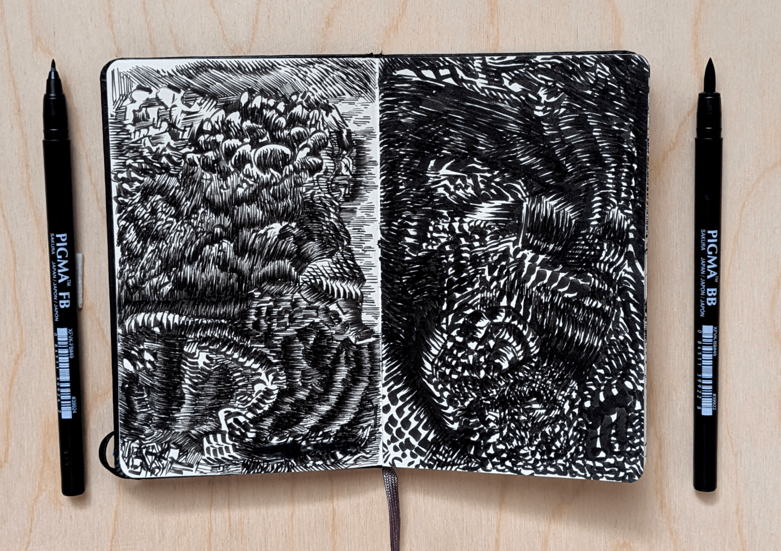
Experimenting with different pens in a sketchbook, I thought it might be interesting to try this contrast. The page on the right was done with the fattest pen from this brand line while the left was done with the thinnest.
If this sub isn’t really for sketchbook work, my bad, please just let me know .
Those are really good. The noir obscure and the hatching to create them are great.
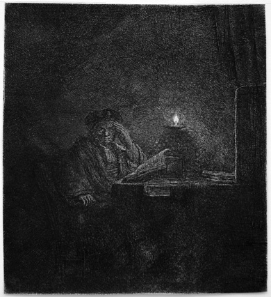
You want to study etchings,I recommend those by Rembrandt and Gustave Doré. Those are the greatest artists in that technique (imho) and show what you can do…
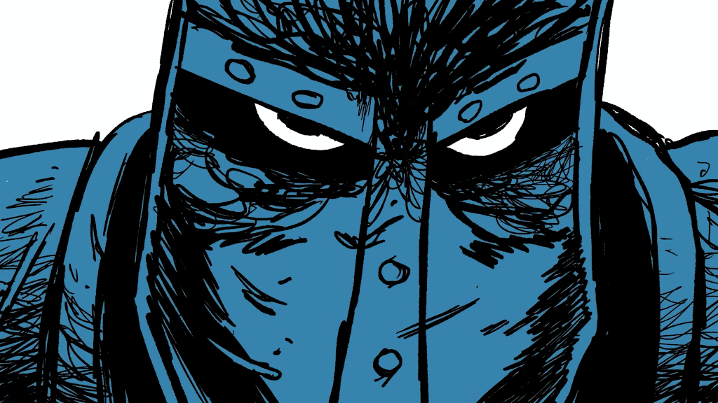
New Berserk chapter looking good
lolololol
Never read any of that series but I know it’s highly respected so I’ll take that as a real compliment!
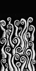
The thin pen conveys motion in this style, while the fat one emphasizes negative space well.

