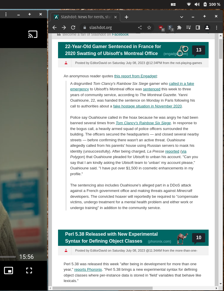
You can’t even just uBlock zap the sidebar since the feed div has a fixed right margin. StyleBot to the rescue.

Much better!
Also mildly infuriating is if you try to grudgingly load the mobile site in a desktop browser, it just redirects you back to the crappy, non-responsive desktop version.
If you found this useful, here’s the CSS overrides to use:
#slashboxes {
  display: none;
}

.main-content {
  margin-right: unset;
}


Thank you for this! I’ve always been annoyed by non-collapsable, intrusive sidebars. Slashdot’s just seemed to get wider, and wider, over the years.
I’d found this when I used to go to old.reddit: javascript:$(‘.side’).toggle();void(0);
I made it a bookmark on my bookmark tool bar to toggle the right sidebar on my main page
I made an extension to reduce the padding in Jira’s rows when it’s listing tickets. Basically a “compact” view.