- cross-posted to:
- [email protected]
- cross-posted to:
- [email protected]
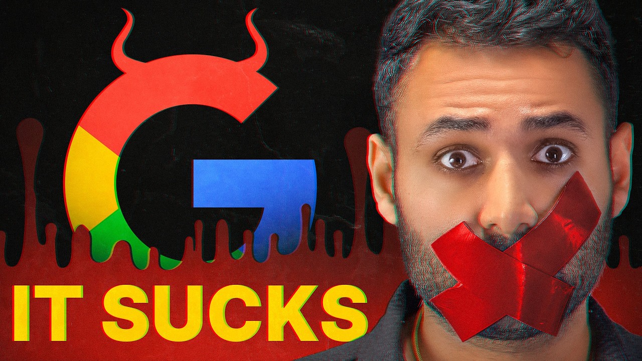
YouTube video: https://youtu.be/uSGVk2KVokQ
Invidious same video from YouTube without YouTube client: https://inv.nadeko.net/watch?v=uSGVk2KVokQ
Video description:
Pls Google do something.


1:42 into this, and “above the fold” – while defined correctly within the scope of newspaper layout – somehow ignores the ear ads that have been showing up for decades. Hell, I was involved in redesigns where the big question was “OK, but how do we fit more ads in there?”
This is in fact how one gets from a good design decision to offending readers with an unfulfilled promise, and this ain’t coding.
In the early aughts, there was a fad for taking up newshole just inside the paper to … tell readers what was in the paper. No one is buying something off the rack to open it to A2 to figure out what the refers are, but some metros were doing it, and midsize dailies tended to be lemmings 20 years ago.
I went several rounds with editors, folks from advertising and even higher-ups at The Washington Post (for unusual reasons) crafting what Page 2 would consist of. Upper half of the page was pretty much set in stone, with 4-col art that somehow needed to be demoted to A2 because we rarely went bigger than 3 cols out front (you try fitting nine stories plus at least three pieces of art, refers, index, blacklines [obit names], weather and anything else out front on a 44" web down from full broadsheet).
The bottom half was another story. Early on, it was decided that we’d have most of the bottom half of the page be a story we called (I shit you not) “A Closer Look” (I did it first, Seth). The idea was we had about 30" to play with and could run a wire story that was interesting but not A1 worthy … not exactly a feature, just news that wasn’t paper-of-record news. This concept would reappear out front downpage at a later paper, where it was called “Editor’s Choice.”
Once ads was done with that voodoo they do so well in terms of selling positions, we had on a good day 10" for A Closer Look, leading to it being internally referred to as A Cursory Glance. To the point that within two weeks, even the managing ed would ask in the budget meeting what we had for A Cursory Glance that evening as the guy who insisted on keeping the overline as “A Closer Look,” as that’s what he sold the publisher on.
I’m morbidly curious to continue watching and will from here, but Google didn’t invent shitty ad placement that insulted their audience anymoreso than Apple invented flat, rounded rectangles; print was there around 9/11 (and before, if one considers the precursor to “native advertising,” “sponsored content” – that editorial-looking stuff in the wrong typeface saying that, for example, you could only buy these exclusive silver coins during a half-hour window based on ZIP Code).
This is the logical continuation of unregulated late-stage capitalism. Pretending it’s about tech is certainly a framing choice, but it isn’t the right one.
To be honest I found the comparison with the physical newspaper a bit out of place. Its always interesting to read the perspective from someone behind the scene. But I cannot comment here, because I never read newspaper (i’m old enough, just not interested).
But overall the video is entertaining and doesn’t do much bullshit or like that. I knew most of the stuff anyway, but didn’t know how bad Google got, because I don’t use Google (directly) since years. And certainly I don’t search for stuff to buy.